As I go into more intermediate/advanced methods designers and illustrators use, I discovered two ways to prepare. Judging from my previous reflection.
There's perquisite knowledge that a beginner needs to know before he gets into the meat of this all. Even then, there are fundamentals that need to be worked in the artist's journey.
Character design: Anatomy, design sensibilities, graphic design. Perspective.
Environmental Design: Perspective, architectural design, landscaping design. Studying and sketching rural/urban environments.
Prop design: Still life knowledge, reference to items and it's taxonomy. Various objects of the professions and occupations.
Now, Elaboration on the two methods
So, one has an idea, how do they go about it?
- The off the cuff, anything goes methodology
Ah! The intuit je ne sus quoi, right on the page. With minimal reference, constrained or otherwise.
This helps with making with the door shut. Entertainment shut out. Backstory improvised. Freehand sketches are made from thumbnails and then to refinement if possible.
Then, the work happens afterwords.
 |
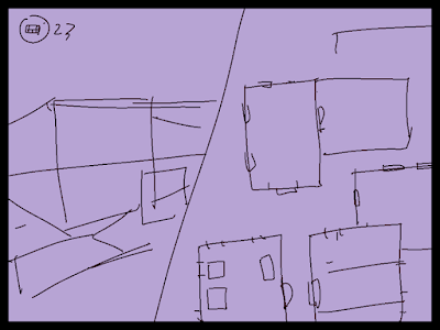
| Chelsea's Perspective for comic book artists. P. 108 Where he does an off-the-cuff improvisation of a science fiction environment. I did it myself, getting lost of drawing one of my own backgrounds, using some two-point perspective vanishing points and making up a rural town setting. |
- The plotters overkill methodology
This is more thought out, with a writing prompt. Then with layouts with minimal perspective.
Like an architect, landscaper making plans for sufficient visualization on their client or themselves. This is boring, yet it's the point to understand.
A reverse engineer of the subject to help make sense of it all.
 |
| Rendering in Pen and Ink by Arthur Guptil P 176-177, All the plans an architect lays out. One can mess, improvise and do a combination of the two. Oh, Both books are recommended by the way. |


